More TV art history: the paintings in Downton Abbey are maybe anachronistic?
Posted: February 26, 2014 Filed under: art, tv Leave a comment[Disclaimer: I have no training in or formal education about art history – I’m just an art enthusiast. If I’m wrong about something, please let me know!]
I want to do a post on the art in House of Cards season 2, but first, a quickie on Downton Abbey Season (or “Series,” if you’re British) 4. Notably, the season finale/Christmas special was principally set at “Grantham House,” the Granthams’ house in London.

The scenes that took place in this room – the “Octagon Room” of Basildon Park – were perhaps undermined, in my opinion, by this set of distractingly arresting paintings. It really took only the most convoluted of scheming to turn my attention back to the story.
The paintings are by the 18th century Italian painter Pompeo Girolamo Batoni. In the Vanity Fair photo above, clockwise from top left, the paintings depict Saints Thomas, Peter, Matthew, and Philip. I wish this selection of saints serve as a foreshadowing for next season, but I doubt it. Anyway, some interesting stuff is contained in the National Trust descriptions of the paintings; for example, these pieces were not likely to have been exhibited in the time and place depicted in the show:
It is more unusual, as Francis Russell has said, that they should have been painted as a set of pictures for a private collection (though Rubens painted a set for the Duke of Lerma around 1611-12, and Van Dyck another for an Guilliam Verhagen around 1620/21 , for which there were precedents ), and even more so that the major part of one such set should adorn an English country house . If anything – despite the fact that the Apostles were amongst the saints that the Anglican church continued to recognise – sets of Sibyls were more common as an adornment of English country houses than were the Twelve Apostles. One reason for this was, perhaps, that paintings were very rarely collected in England for their content; if anything, they were collected in spite of it (otherwise, not only the profusion of Madonnas and Saints, but also the early English taste for Murillo, with his proliferation of child-angels, would be inexplicable). Yet even in Italy, where these particular Apostles once formed part of the greatest single concentration of Batoni’s work – the Merenda collection in Forlì – it was unusual to commission religious subjects specifically for a picture-gallery as opposed to collecting them après coup – and it normally betokened, if anything, a weakening of religious sensibility, that such was the destination for which pictures of the kind were painted. [Source]
The oval painting shown in the photo above appears to be “Cleopatra, Mark Antony and the Pearl,” by Giovanni Battista Pittoni the younger, a Venetian painter just about a generation ahead of Batoni. This painting also seems a little anachronistic to be included on the Downton set – all of these paintings didn’t come to Basildon Park until the late 1960s. However, it does illustrate an interesting and thematically resonant episode, about Cleopatra’s profligacy, which should maybe be discussed with Lord Grantham.
Somewhat relatedly, I also came across a great blog that discusses anachronisms in dialect and word usage, including an interesting post on Downton Abbey season 4.
Art history in ‘House of Cards.’ (Spoiler-free!)
Posted: February 11, 2013 Filed under: art, original research, tv 3 CommentsThe new Netflix original series House of Cards, starring Kevin Spacey and Robin Wright, has gotten a lot of buzz lately. Much of the attention has focused on its innovative business model, but it’s also been pretty widely critically acclaimed for its writing and acting; Fresh Air‘s TV critic notably called it “the best TV series about American politics since The West Wing” (also now streaming on Netflix).
One thing that seems to have been under-discussed is its great use of art (something which is generally under-recognized in TV criticism in general, I think – see, e.g., the excellent pieces featured in the recently-ended Gossip Girl). Although House of Cards is set in Washington, D.C., it seems that much of the show was shot in Baltimore and its environs. Since Baltimore is the one place that I’ve lived for the most consecutive years since college, it’s pretty near and dear to my heart, and I’ve enjoyed picking out scenes that I recognize and remember from my life there. For example, in one of the first few episodes, Robin Wright’s character goes for a run through Wyman Park Dell, right past a patch of vegetation where my dog often used to poop.
Other scenes seem to take place in and around the Baltimore Museum of Art. In the first episode, a key scene (pictured in the top photo here) occurs where the characters played by Kevin Spacey and Kate Mara have an incognito meeting at an art museum; they trade secrets while staring at a painting of two rowers, while Spacey’s character, Congressman Frank Underwood, talks of how they are now like the figures in the painting: in the same boat. I was intrigued by the painting but didn’t recognize it; I went to Quora to ask if anyone knew who painted it but didn’t get a responsive answer, so finally got around to digging it up myself:

The Biglin Brothers Racing.
The painting is called The Biglin Brothers Racing, by the American painter Thomas Eakins, and it’s in the collection of (and currently on view at) the National Gallery of Art. It was painted in 1872, and the NGA’s page notes that at the time, following the Civil War, rowing became a hugely popular spectator sport. This painting depicts the champion rowers racing on the Schuylkill River, a tributary to the Delaware River, in or around Philadelphia. This seems like it might be an oblique reference to the hometown of Congressman Peter Russo, another character who later introduces a bill related to the Delaware River Watershed (more on that fictional legislation later, perhaps).
In the ninth episode, Zoe and Frank meet again in front of a painting, although their relationship and circumstances are much changed. This time, they sit in front of a very different painting, Little Girl in a Blue Armchair by Mary Cassatt:

Little Girl in a Blue Armchair.
This is a pretty curious composition, and contrasts greatly with the Eakins, even though, interestingly, they are both from about the same time. Little Girl was painted in 1878, just five years after The Biglin Brothers, but the styles are so markedly different that they almost seem to come from different eras. Which makes it all the more interesting, then, that Cassatt and Eakins were not just contemporaries but were both native Pennsylvanians (like Congressman Russo).
I won’t get into unpacking the symbolism of either painting in the show’s narrative, as it’s fairly obvious and I don’t want to spoil the story for anyone who’s just starting. I will say that I think Little Girl is about a girl’s unseen interior life (which, happily, prominently features a dog) while The Biglin Brothers is more about movement and concerted action.
Also, the NGA’s website says Little Girl is not on view, and in House of Cards, it appeared to be hung inside the Baltimore Museum of Art. It looked to me like it was right outside the gorgeous Atrium Court.
There are a lot of amazing specimens of American art hanging in the various politicians’ offices too – maybe a topic for a future blog post. And I’m not an art historical expert by any means, so please chime in if you have corrections or anything else to add!
A coincidental dog print.
Posted: August 1, 2011 Filed under: art, design Leave a commentI spend far too much of my time browsing blogs for eye candy: design, fashion, interiors, etc. You read enough of these blogs and the style trends become repetitive, and the popularity of certain products becomes cliche (as happened with the Keep Calm and Carry On print last year-ish). Anyways, today I spied the same print in two different decor blog posts:


Granted, two different colorways, but looks like the same image to me. Its popping up like this in two disparate corners of the Internet make me curious. Anyone know who makes it? The Glitter Guide says of the first one that it was once a floor display at Anthropologie.
Art is also for upsetting and annoying.
Posted: July 22, 2011 Filed under: art, climate change, coal, energy policy, environmental law, politics Leave a commentThe Guardian has a better picture of it, but the NYT’s Green blog has the better headline about it: “Coal-Themed Sculpture Annoys Lawmakers”.
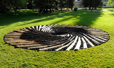
The sculpture, by British artist Chris Drury, is made of logs from lodgepole pine trees killed by pine beetles, along with lumps of Wyoming coal. According to the Guardian, beetles were still infesting some of the logs in the sculpture! I wish I could get a better look at that.
The piece, installed on the University of Wyoming campus and independently funded, is evidently meant to draw connections from coal-fired electricity generation to climate change-caused warming and its effect on pine beetles. Warmer temperatures mean that pine beetle populations are experiencing less die-off during the winter, increasing numbers at an alarming rate, and decimating pine forests across North America.
Unsurprisingly since Wyoming is the country’s leading coal-producing state, once local politicians found out about the sculpture, they were “annoyed.” The money quote is from state legislator Tom Lubnau, who says:
While I would never tinker with the University of Wyoming budget – I’m a great supporter of the University of Wyoming – every now and then, you have to use these opportunities to educate some of the folks at the University of Wyoming about where their paychecks come from.
Or, in other words, “Nice university you got there. It’d be a shame if anything ever happened to it.”
To its credit, the University of Wyoming is standing by Drury’s work and has no plans to remove it. But I’m disappointed that the art museum’s director backpedaled by saying, “Chris Drury makes connections within nature. He’s not a political artist in any way.” I don’t know what that’s supposed to mean exactly; it seems to me that any work commenting on “nature” and humanity’s relationship with it, particularly in the realm of climate change, has to be “political” in the sense that policies (about energy) are implicated. Drury clearly intends this piece – entitled “Carbon Sink: What Goes Around Comes Around” – to be about climate change and the human hand in it with relation to coal as a fuel source.
What’s more, it’s unfortunate that the art museum director didn’t take the opportunity to affirm that making political statements is an age-old, historically legitimate and valuable role of art – especially public art. Although that might not really be up for debate in Wyoming, where opposing legislators have apparently “suggested that a sculpture of energy workers be built on campus.” Yes, let’s discuss coal mining!

Such a dialogue seems exactly in line with Drury’s intentions: he’s quoted as saying he hopes the sculpture will cause people to “have a conversation.”
Drury also has some really interesting pictures and commentary of installing the piece at the University of Wyoming on his blog.
Relatedly, the U.S. Fish and Wildlife Service just issued a finding that whitebark pines merit protection under the Endangered Species Act. Although the FWS declined to place it immediately on a federal protection list due to limited resources, it has assigned the whitebark a high priority for future listing. You can read more about the whitebark pine and why protecting it matters in this blog post by Matt Skoglund of NRDC, the group that filed the 2008 petition spurring the FWS’ finding.

Recent Comments